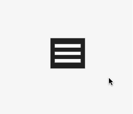
汉堡式菜单,由三根平行的直线组成;返回箭头,由两个对称倾斜的箭帽和一条水平直线组成。下面我们就通过使用 CSS 来实现上图的转换效果。
实际效果见banner。
HTML
1
2
3
4
5
6
7
| <div class="toggleContainer">
<div class="inner">
<span class="line line-first"></span>
<span class="line line-second"></span>
<span class="line line-third"></span>
</div>
</div>
|
- span.line 表示三条直线
- div.inner 负责包裹三条直线,直线的位置会相对于它进行变化
- toggleContainer 负责最外围的包裹,用来设置 padding,起美化作用
白色直线的 CSS
1
2
3
4
5
6
7
8
9
10
11
12
13
14
15
16
17
18
19
20
21
22
23
24
25
26
| .inner .line{
display: inline-block;
width: 100%;
height: 8px;
transition: all .5s;
position: absolute;
left: 0;
background: #fff;
}
.inner .line-first{
top: 0;
}
.inner .line-second{
top: 50%;
transform: translate(0, -50%);
}
.inner .line-third{
bottom: 0;
}
|
div.inner 和 div.toggleContainer 的CSS
1
2
3
4
5
6
7
8
9
10
11
12
13
14
15
16
17
| .inner{
width: 100%;
height: 100%;
position: relative;
}
.toggleContainer {
width: 80px;
height: 70px;
padding: 14px 10px;
box-sizing: border-box;
background: #222;
cursor: pointer;
}
|
经过上面的设置后,已经能够看到一个汉堡菜单了,接下来就需要编写 hover 时的 CSS,让三条线动起来。
给三条线做CSS动画
1
2
3
4
5
6
7
8
9
10
11
12
13
14
15
16
17
18
19
20
|
.toggleContainer:hover .line-first{
transition: all 0.5s;
width: 50%;
transform: rotate(-45deg);
top: 5px;
left: -1px;
}
.toggleContainer:hover .line-third{
transition: all 0.5s;
width: 50%;
transform: rotate(45deg);
bottom: 5px;
left: -1px;
}
|
最后
有很多简单的线性变化都可以使用 CSS和HTML 来实现,找出其中的位置、角度、大小等变化,操作起来就非常容易了。